From WAP to HTML5 an overview.
© copyright nokia.com
© copyright nokia.com
Wireless Application Protocol
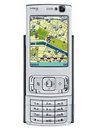
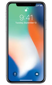
From 1990 it has been possible to see web pages on a mobile, the Nokia 7110 being one of the first devices. This was a very limited, even for those days, version of the web. Now with the iPhone X and other smartphones, a very sophisticated web is available. Here we will look at the development from Wap to Bootstrap and beyond
- In order to deliver some web pages to the mobile phone a whole new infrastructure of WAP and WML was developed. The system was slow on contemporary mobile devices, and developers really wanted to use the same language on the desktop and the phone. However this technology did deliver the web on a phone.
- With the introduction to more complex mobile devices a new approach was required. If we write using XHTML (XML comliant HTML) then this could be made to work on both the desktop and the mobile. The same site on both devices. However various standards including XHTMP-Basic and XHTML-MP were developed to allow XHTML to deliver on the phone. None of these solutions become popular thus leaving the mobile web behind in development. The goal was to use the same HTML codebase to deliver the same site to a mobile as wellas a desktop. With careful writing of the HTML this was possible.
- JQuery Mobile (JQM) was one of the first packages that genuinely delivered mobile web to the device. This became possible with the good and fast implementations of Javascript on the mobile device. JQM delivers a number of pages to the mobile device with local navigation between these pages. The default method of navigation in JQM is AJAX making for more efficient use of the Internet.
- Bootstrap and other frameworks claim to mobile first. The idea being that the site is written once and rendered differently, and appropriately, dependent on the device viewing the site. Using media queries, the same code base can be rendered appropriately as the device requires, with the data coming from the same codebase.
- There is a move now to recognise the difference in characteristics between the Desktop or laptop and the phone. Because of this there are different tasks that a user will want to use on a mobile device as opposed to a desktop or laptop. To achieve this we will need access to many of the features of the phone including GPS, NFC, Orientation, Contacts, Fles, SMS etc
There are two was to think of web development for the mobile and none-mobile devices :
- Write a single site using responsive design that renders appropriately for the device. This will deliver the same content to each device suitably rendered. Whilst this may achieve a mobile web site, it does not give a specific user interface for the mobile device
- Automatically detect the device type and swap to the most suitable version of the site. Usually a mobile and non-mobile site will be available. The former having mobile specific features including an appropriate set of features for the mobile user
- If the same information is to be provided on each device, then use responsive; if different features are needed then separate sites.
mobilephonetechnology.co.uk is a collection of terms used in mobile phone technology. The aim is to inform the user regarding mobile phone technology. It is our belief that users who have at least some understanding of the technology behind their phone can make informed choices regarding network use, device or app choice thus getting a better service from the phone and phone company.
An informed user can more confidently understand what is being said about the phone or network in the press or retail outlet and can make better decisions. The aim of this site is to provide some information about mobile phone technology to aid the informing of the mobile phone user
2016 was crossover year where over 50% of Internet traffic was driven by mobiles rather than laptops or desktops. The (smart)phone in your pocket is a very powerfull computer with fact connectivity.
The first mobile appeared in 1990 with the aim of providing mobile phone calls. Since then SMS messages were added as a secondary communication medium. The Internet was added in 2001 with the advent of WAP technology. Since then the phones and communications have developed to the modern ubiquitous smartphones of today.
Fast access to the Internet is key to the contemporary mobile phone user. It is needed to support many mobile apps, to deliver fast social media apps and information via the billions of Internet sites. What next? Your guess is as good as mine, but most observers believe that "artificial intelligence" will grow over the next few years.
To contact us send an e-mail to the address below and we will get back to you


 mobilephonetechnology.co.uk
 mobilephonetechnology.tumblr.com
*u* ©mobilephonetechnology.co.uk all rights reserved 2017- 2026